
Two levels can look identical on a chart — same number of touches visible, same distance from price — and behave completely differently when price returns. The difference usually isn’t the level itself. It’s the history around it: whether the zone is still clean, or whether it has already been chewed up.
A contaminated zone is a graveyard of old orders
A contaminated zone is an area price has visited too often. Stop losses have been triggered there, false breakouts have ripped through in both directions, and both buyers and sellers have already done their business in that range. What’s left is a messy battlefield where nobody really has control.
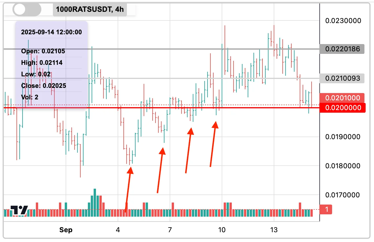
When price comes back to a zone like this, the move tends to stall, chop, or fail outright. Not because the market “tricked” anyone, but because the orders that would have powered a clean reaction were consumed weeks ago. The liquidity that once rested there is gone, and what replaced it is noise.
A clean zone still has its energy stored
A clean zone is the opposite: price touched it a few times, respected it, and then left it alone. No chop, no cluster of stop hunts, no repeated grinding. The orders resting behind it are still intact — untested liquidity that hasn’t been spent.
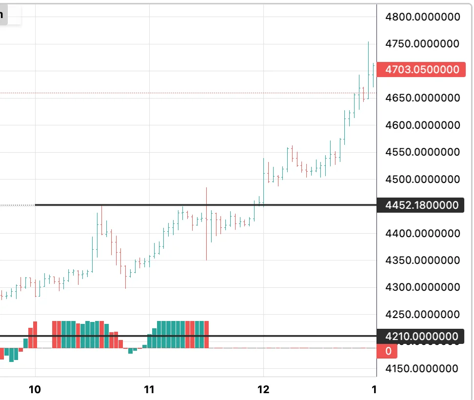
When price returns to a clean level, there is energy waiting to be released, and the reaction — whether a hold or a break — tends to be decisive. It is the same logic as accumulation: stored energy produces real moves, spent energy produces chop.
The boxing ring and the bar fight
The comparison I keep coming back to: a clean zone is a fresh boxing ring. Both sides arrive with energy, and the clash decides a winner. A contaminated zone is a bar fight at closing time — half the participants are exhausted and swinging wildly, and the outcome is chaos no matter who was “right.”
How to tell them apart on your own chart
When marking levels, the question is not just where did price stop before, but what has happened to that area since:
- A level that has been left alone for weeks is usually still clean.
- A level tested several times in a matter of days is losing its charge with every touch.
- A zone that false breakouts have already swept in both directions is spent — whatever information it once carried is gone.
Age alone doesn’t make a level good, and touches alone don’t make it bad; what matters is how much of the resting interest has already been consumed. That is also why the first return to a well-formed level is watched so closely — it is the one moment the zone is guaranteed to still be clean.
The next article in this series takes this further: the seven filters that decide whether a level is worth watching at all.
Separating levels that still carry energy from zones that have already been spent is exactly what ChartThread’s levels are built to do — continuously, across every market you follow.