How it works
Three screens, read in this order.
ChartThread is not a feed of signals you react to. It is three screens you read before the session starts: where the levels are, which level is worth your attention today, and what it costs to hold a position across two venues. Below, each screen is shown exactly as you will see it, with the parts labelled.
Every level is already drawn, on every symbol
Open any pair on Binance or Bybit, spot or futures, and the levels are on the chart before you are. You never draw a line and you never decide which ones count: the same construction rules run on every symbol, so a level either qualifies or it does not.
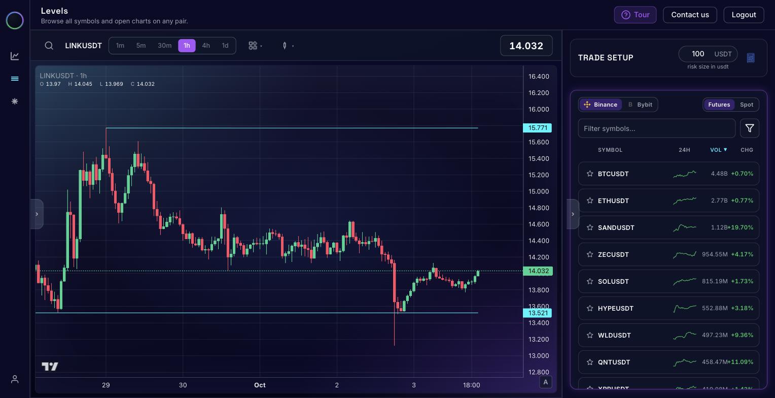
How to read this screen
-
The cyan lines are the levels. Here, 15.771 above price and 13.521 below. A level is always the footprint of an important event on the chart, and there are several distinct types of them. The rules that find them are deterministic: the same chart always yields the same levels, with no discretion anywhere in the loop. See them on the Levels screen →
-
The badge is the exact number. Never a zone. You cannot size a position or place a stop against a band; you can against 13.521.
-
The green dashed line is price right now, sitting between the two levels. That distance, how far price is from each wall, is the whole point of this screen.
-
The right pane is every tradable symbol: not only crypto, but the stock and commodity instruments listed on these venues as well, each with its levels already drawn. Binance or Bybit, futures or spot, sorted by volume, filtered by name, starred if you follow them.
-
Step through the list with the arrow keys. Up and down move from symbol to symbol and the chart follows, so you can review a whole watchlist without touching the mouse.
A level is not a signal to enter a trade
It is the first of the four pillars a trade stands on, and on its own it tells you nothing about whether to buy or sell. What a good level gives you is a price worth watching: somewhere to observe how the instrument actually behaves when it arrives.
What that behaviour turns out to be (a bounce, a breakout, or nothing worth trading at all) is what decides whether you take a position, and that decision is yours. Always do your own research and trade according to your own strategy.
What you do here: note where price sits between the nearest level above and below. That map holds for the whole session: levels are built on daily candles only, and are updated once a day at 00:00 UTC.
A shortlist, out of more than a thousand instruments
Knowing where every level is does not tell you where to look. This screen ranks the levels price is interacting with right now and names the behaviour in play, so your session starts with a handful of candidates instead of a market.
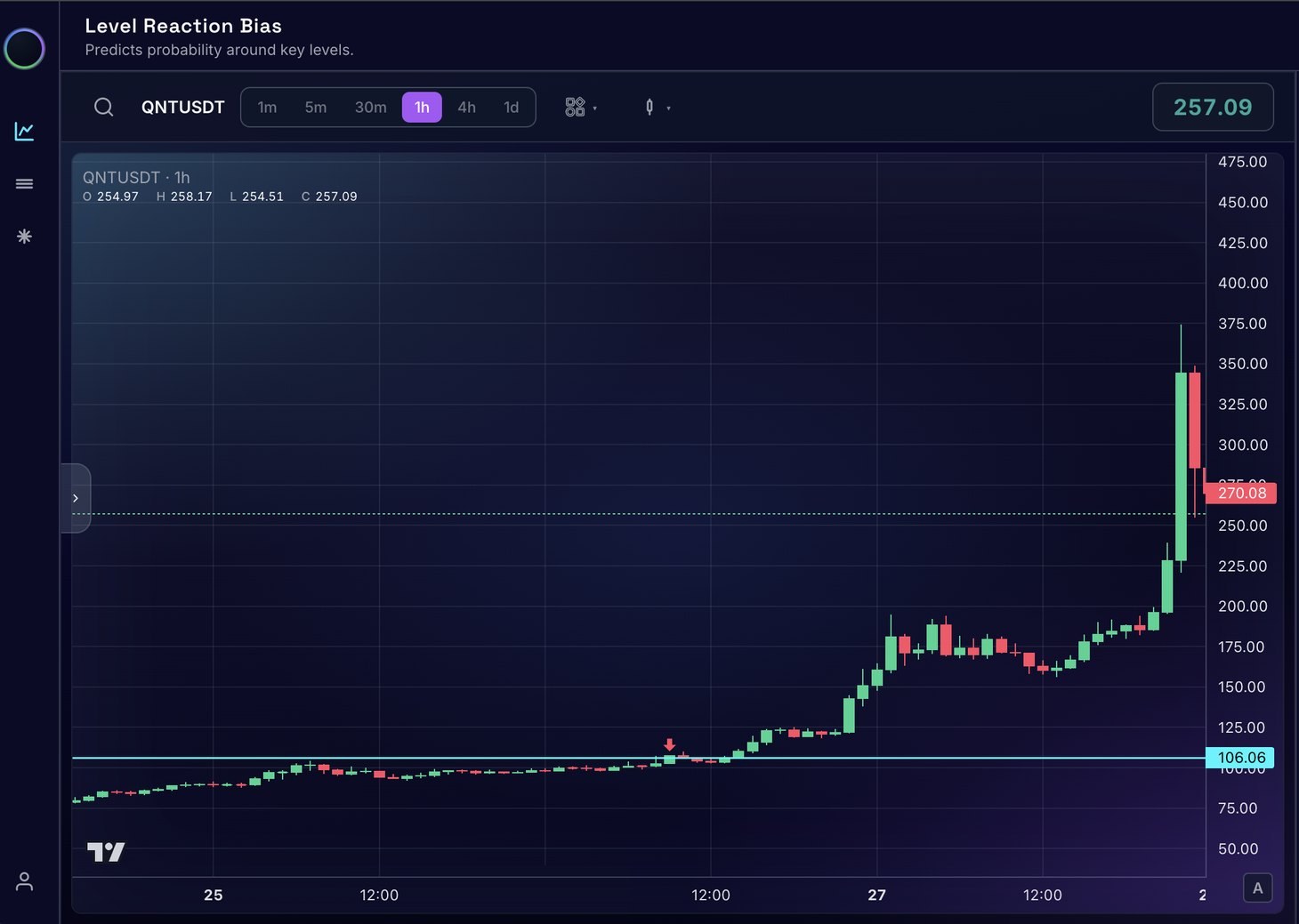
How to read a card in the Active Levels list
-
The direction the odds lean at that level, from the structural prerequisites the algorithm checks on the chart. A reason to look, never an instruction to enter.
-
The behaviour in play. Only three things can happen at a level: it holds and price rejects away, it breaks and price continues, or it breaks and fails back. This names which one the algorithm sees.
-
The level itself, to the tick, with a copy button beside it, and drawn as the cyan line on the chart so you can see it in context.
-
The gauge is the balance between rejection on one side and breakout on the other. A needle leaning one way is a probability, never a verdict: the platform can be wrong, and says so.
-
Traded volume on the instrument. A level on something nobody trades is a level you cannot get filled at.
-
The star and the envelope keep a symbol pinned to your list and let you be told when something happens at that level, instead of watching it.
Why this one reads long
For days price grinds sideways directly beneath 106.06, in a range that keeps tightening against the level. That compression is the prerequisite: a breakout takes energy, and the energy has to be accumulated before it is spent: someone large enough to move the instrument absorbs everything offered under the level first, then takes price through it.
That is what makes the bias long, and why it is readable before the move rather than after: the tell is the squeeze into the level, not the breakout candle. Once the candle prints, the information is already public.
Once you have picked a level, the Trade Setup calculator does the arithmetic. You give it the risk you accept in USDT along with your entry and stop; it returns position size, margin, commission, risk/reward, the share of the day's average range your stop spans, and the price at which you would be liquidated, and draws all of it on the chart. Every field has a copy button, because ChartThread is never connected to your exchange: you place the order yourself.
What you do here: pick the two or three cards worth your session, star them, open one chart, and size the trade before price arrives. Everything else you ignore.
The same contract, priced differently on two venues
The same instrument trades on Binance and on Bybit, and the two prices do not always agree. Most of the time the gap is noise. Occasionally it is not. This screen tracks that gap after fees and funding, because a gap that looks worth taking gross is often not worth taking net.
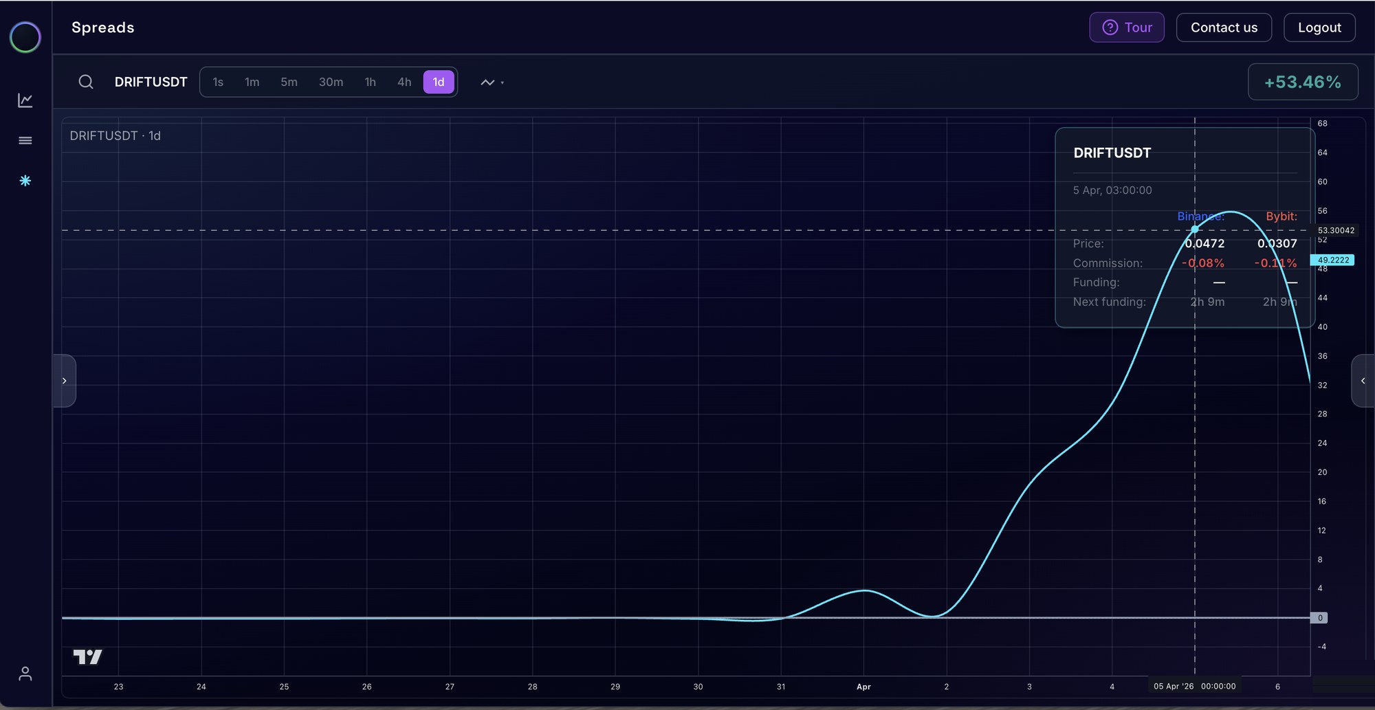
How to read this screen
-
The line is the divergence over time. Flat on zero means the two venues agree. The climb is the two venues coming apart, which is the entire reason this screen exists.
-
The badge is the net figure at the crosshair, after commission and funding, not the gross price difference. Move the crosshair and it reads that moment instead.
-
The card compares the venues side by side: Binance in one column, Bybit in the other, so you can see which side is rich and which is cheap.
-
Funding is paid or received on each venue, and the countdown says when the next settlement lands. Hold long enough and funding, not the gap, decides the outcome.
-
Fees are shown per venue and already deducted from the figure ChartThread reports, so what you read is net divergence rather than the gross price difference.
-
Active spreads are ranked on the right, largest net divergence first, each with an alert toggle so you do not have to sit and watch the list.
What this chart shows: the same contract, 53% apart
For weeks the line sits flat on zero: DRIFTUSDT is priced the same on both venues and there is nothing to do. At the start of April it lifts off, climbs for three days, and peaks on 5 April 2026. Put the crosshair on the peak and the card reads the whole story: 0.0472 on Binance against 0.0307 on Bybit, commissions of 0.08% and 0.11% taken off, leaving +53.46% net.
Fifty-three percent on an identical contract is not a fee difference or a rounding error. It is a dislocation, and the chart shows it collapsing back toward zero within a day of the peak. It is also invisible unless something is watching both order books at once, which is the entire job of this screen.
How a divergence like this is traded
The mechanics are symmetrical: short the venue where the contract is expensive, long the venue where it is cheap, and close both legs once the two prices meet. You are not betting on direction at all: the position is flat to the market and exposed only to the gap between the venues.
It works because the same instrument tends toward the same price over time. A divergence is a market inefficiency, not a new valuation, and inefficiencies close.
Speed decides the edge. The gap you can act on is the one that is still open, which is why the monitor runs continuously rather than on refresh.
Time is a cost, not a cushion. Hold the pair too long and funding eats the position, even while the trade is working.
The legs do not protect each other. They sit in separate margin accounts, so a move far enough against one can liquidate it while the other cannot offset the loss.
Do the arithmetic first. Net gap against funding and fees for the time you expect to hold. Trading always carries risk, and this is not an exception to that.
ChartThread shows you the divergence. It does not place either leg, and nothing here is a recommendation to trade. Always do your own research.
What you do here: if you trade on both venues, check whether the net gap pays for the funding you would carry while the two prices converge. If it does not, there is no trade.
The routine, once a day
Markets run around the clock; your preparation does not have to. The levels only change when a daily candle closes, so this is a once-a-day job, done before price arrives, not while it moves.
-
1
Read the map
Where does price sit between the level above and the level below?
-
2
Cut to a shortlist, then size it
Two or three levels with a bias; the calculator turns each into a position size and a stop.
-
3
Check what holding costs
If you run positions on both venues, the net spread and funding decide whether it is worth it.
Open the three screens yourself
Free while in early access, no card and no trial clock. The FAQ answers the fifteen questions we get most, and anything else goes straight to the founder, with replies within 24 hours.