
Zoom out on any chart and most of the noise disappears. Underneath the wiggles, a market is only ever doing one of two things: storing energy or spending it. Traders call the two phases accumulation and distribution, and once I started reading price this way, the moves that used to look random started to have a visible preparation phase.
Accumulation: the market storing energy
Accumulation is the slow, usually boring phase. Price grinds sideways near a level, the candles shrink, and volatility fades. Nothing about it looks exciting, and that is the point: large players don’t smash through a strong level in one heroic order. They spend days or weeks quietly building positions, absorbing whatever the other side offers, without moving price enough to advertise what they are doing.
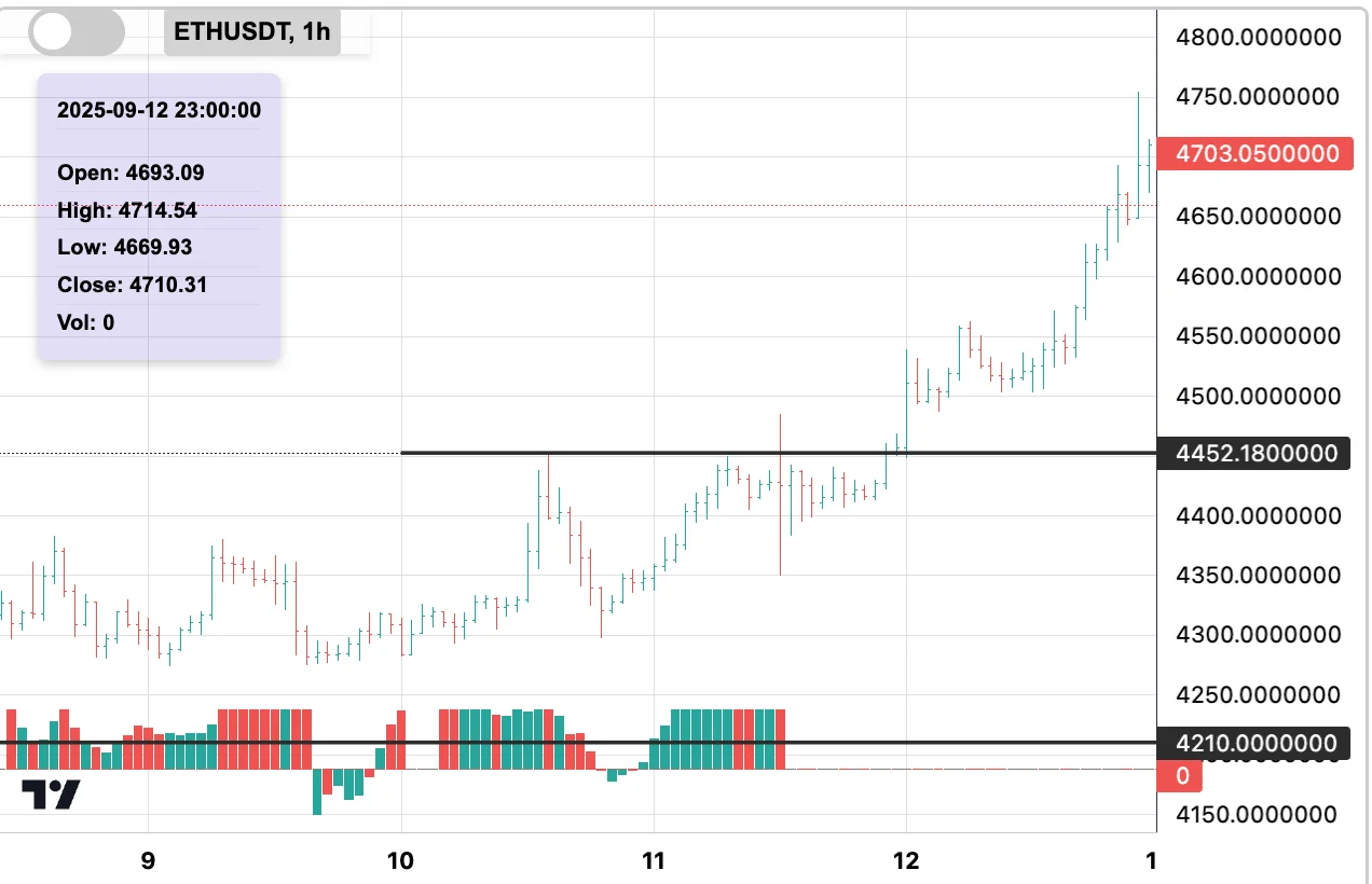
On the chart it leaves fingerprints:
- Shrinking candles near a level, as if the market is holding its breath.
- Higher lows (or lower highs) pressing price into a corner.
- Repeated retests of the same level in a short window — one side refuses to back off.
- Volume that quietly builds while price goes nowhere.
That compression is stored energy. When it finally releases, the move tends to be fast and one-directional, because everything that could have resisted it was already absorbed during the quiet phase.
Distribution: the market spending energy
Distribution is the opposite: the spending phase. Price rushes at a level on oversized candles, volatility spikes, and the move looks unstoppable — which is exactly what makes it treacherous. A vertical approach means the energy is being burned on the way in. By the time price reaches the level, there is often nothing left to break it with.
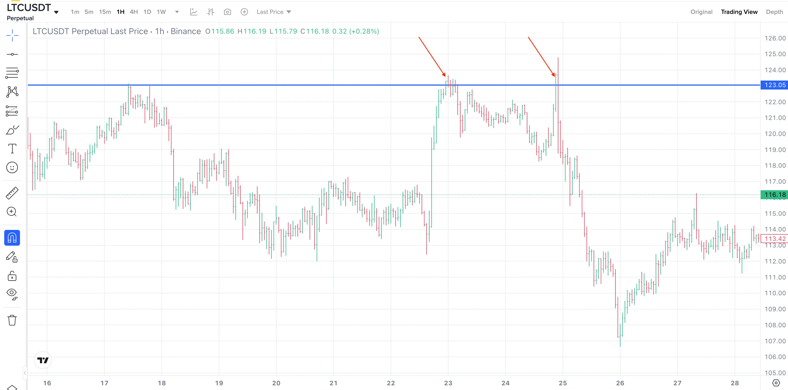
The fingerprints of distribution:
- Vertical, V-shaped approaches into support or resistance.
- Oversized bars that cover a whole day’s typical range in one gulp.
- No pauses on the way — no resting phase where buyers or sellers could reload.
A move like that looks like strength. Mechanically it is the opposite: the fuel is being spent in the approach, not stored for the fight at the level.
One question instead of twenty indicators
The usefulness of this lens is its simplicity. In front of any chart, ask one question: is this market charging energy, or burning it?
A breakout attempt that comes out of a long, quiet accumulation deserves respect — the preparation is visible behind it. The same breakout attempt arriving on a vertical sprint deserves suspicion, because there is nothing behind it to sustain the move. Where the reaction happens matters too: the same pattern carries more information during the deep liquidity of the London–New York overlap than in the thin overnight hours.
None of this predicts the future. It just tells you what state the market is in while it approaches a level — and that is where most of the information lives. In the next articles we get to the levels themselves: what makes a zone clean enough to trust, and what contaminates it.
Watching accumulation form around levels, in real time and across many markets at once, is exactly the job ChartThread’s levels do for you.