
Most charts I see are a battlefield of lines: zones, indicators, fib retracements, levels stacked on levels. Draw enough of them and price is always “reacting” to something, which is another way of saying the lines carry no information at all.
The honest number, in my experience: some 95% of the levels people draw are noise. The useful skill isn’t drawing lines — anyone can do that. It’s filtering them. These are the seven filters I run a level through before I consider it real.
1. Historical levels don’t expire
A level that decided a battle years ago can still decide one today. Old highs and lows leave scars in the market’s memory: positions were opened there, liquidations happened there, and participants who lived through it remember the number. A level doesn’t weaken just because it’s old — it weakens when it gets used up.
2. Round numbers attract liquidity
$10,000, $20,000, $100,000 — these aren’t “psychological” in some vague sense. They’re where people naturally place orders, stops, and targets, which makes them magnets for liquidity — and for the stop-hunts that feed on it. A round number alone is a weak signal. A round number that coincides with other filters on this list is one of the strongest.
3. Violent rejections mark real interest
A slow drift away from a level tells you little. A violent rejection — one huge candle that spits price back — tells you money changed hands there in size. Someone defended that price with real orders, and defence like that tends to be repeated. The stronger the first rejection, the more seriously the level deserves to be taken on the next visit.
4. Mirrored levels carry double memory
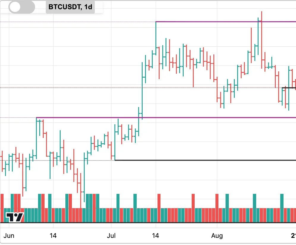
When old resistance becomes support — or the other way around — the level has proven itself from both sides. Buyers and sellers have both used it as a reference. Mirrored levels are rare, but when one appears it carries the memory of two battles, not one. The chart above shows exactly this: the line that capped price in June becomes the floor price stands on in July.
5. Defended levels beat indicators
Indicators are computed from past price, so they lag by construction. A level being defended is observable now: limit orders stacked in the book, absorbed attack after attack. When you can see a price consistently defended with size, that is primary evidence — an RSI reading or an EMA crossover is a shadow of it.
6. Session context weighs the evidence
The same touch means different things at different hours. A test during the London–New York overlap happened against the deepest books of the day; a test at 3:00 UTC on a Sunday happened against almost nobody. When a level was tested is part of how much the test proved.
7. Distance measured in volatility
A level’s relevance also depends on where it sits relative to the market’s current range. Volatility is usually measured in ATR — average true range, the size of a typical day’s move. A level within one daily ATR of price is in play today; a level three ATRs away is scenery, whatever its history. Volatility, not point distance, is the honest yardstick.
Fewer levels, more meaning
Seven filters, one principle: a chart with three levels that each passed real filters says more than a chart with thirty lines that passed none. The filters also compound — a historical level at a round number that produced a violent rejection and is being defended in the book is a different object from a line that merely touches two old candles.
This piece is the map of Part 2 of this series. The articles that follow take the strongest of these filters one by one — starting with why some zones are already spent before price even returns to them.
Running filters like these continuously, across every market at once, is the entire reason ChartThread exists — the levels it shows you are the few that survive the filtering.