Foundations · Lesson 24 of 32
Price charts explained: line, bar and candlestick
A chart is a picture of what price did. There are three ways to draw it:
- A line chart shows only where each day ended.
- A bar chart shows the whole day: where it started, how high it went, how low it fell and where it ended.
- A candlestick chart shows the same whole day, painted green or red, so you see in a glance whether it ended up or down.
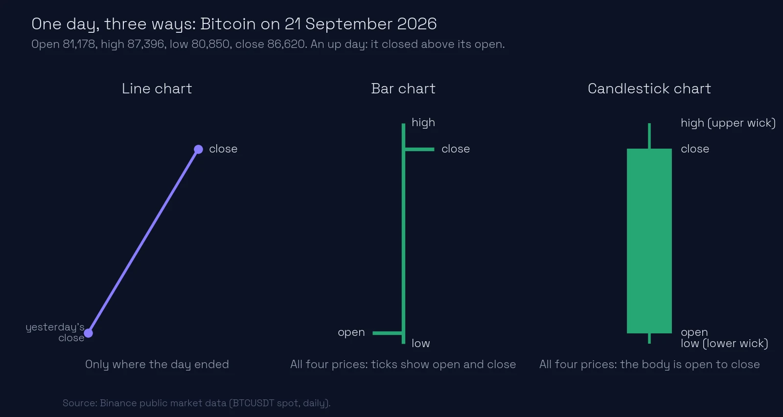
One day, three pictures. The line only says “price went up”. The bar and the candle also show that the day dipped below its open, climbed almost 6,500 dollars, and closed a little under its high.
What you’ll learn
- What line, bar and candlestick charts each show
- What a line chart hides, with a real example
- Why most traders read candles
- Where candles and bars come from: Japanese rice markets and American Wall Street
- How chart choice can change a stop loss
What are the three types of price chart?
Every chart starts from the same raw material: the trades in a market, grouped into periods such as one hour or one day. For each period, four prices are recorded. The open is the first trade, the high the highest, the low the lowest and the close the last. Traders call this OHLC.
- Line chart. Takes one price per period, almost always the close, and joins the dots. Clean and easy to read, but three of the four prices are gone.
- Bar chart (OHLC bars). A vertical line from low to high, with a small tick to the left at the open and a tick to the right at the close.
- Candlestick chart. The same four prices, drawn as candles. The thick body spans open to close and the thin wicks reach the high and the low. A hollow or green candle closed higher than it opened; a filled or red one closed lower.
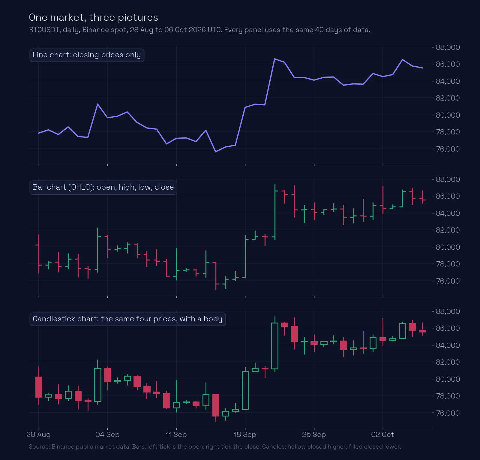
Look at the three panels above. The line makes the trend obvious: a range in early September, a jump around 21 September, then a higher range. The bars and candles tell the same story, but also show how far price travelled inside each day, which the line cannot.
What does a line chart hide?
A line chart hides everything that happened between one close and the next. A day can swing thousands of dollars and still close where it opened, and the line will show a flat stretch.
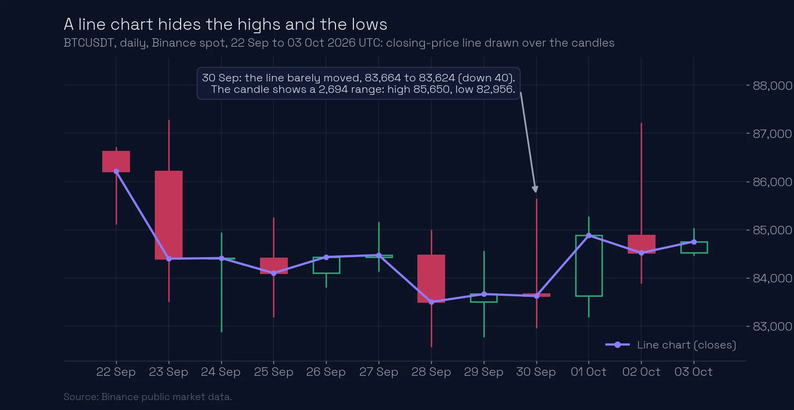
On 30 September the line moved by 40 dollars. The candle shows that price rose to 85,650 and fell to 82,956 during that day. Anyone who held a position with a tight stop that day lived through a very different market from the one the line shows.
This matters most at the extremes. The highs and lows are where price turned, which is where traders draw a level. A line through closes rounds those turning points off.
Why do most traders use candlestick charts?
Bars and candles carry exactly the same information, so the choice is about how fast your eye reads it. A candle’s body turns open-to-close into a block of colour. A row of hollow candles reads as buyers pushing; a long wick stands out as price that was rejected. On bars, the same facts sit in two small ticks you have to look for.
Today candles are the default on almost every trading platform. But they took two hundred years and half the world to get there.
Candles: a legend from the rice markets of Japan
In 1730 the shogun’s government licensed the Dōjima Rice Exchange in Osaka. Rice was Japan’s money then: samurai were paid in it, and merchants traded paper receipts for rice not yet harvested. That made Dōjima one of the first organised futures markets in the world, more than a century before Chicago.
Legend gives the candle to one man: Munehisa Homma (1724 to 1803), a rice merchant from the port town of Sakata. The story says Homma recorded rice prices for years, along with the weather and the mood of the traders, and saw that the market was moved not only by the harvest but by people’s fear and greed. To capture that battle between buyers and sellers in a single mark, he drew the first candles. Tradition credits him with a fortune built on reading those moods, and his family’s house still stands in Sakata.
How much of this is true, nobody knows for sure. Steve Nison, who brought candles to the West, thought candlestick charts as we draw them probably appeared later, after 1850. But the spirit stayed Japanese: candle patterns have vivid names (the hammer, the shooting star, the doji, when open and close are equal), and each one reads as a small story about the battle between buyers and sellers that day. Western traders hardly knew candles until Nison’s book Japanese Candlestick Charting Techniques came out in 1991.
Bars: the chart of Wall Street
America went its own way. In the 1880s and 1890s Charles Dow, co-founder of The Wall Street Journal, studied the closing prices of his stock averages: in effect, line charts. In the 1920s and 1930s the financial editor Richard Schabacker took those ideas to the bar chart, drawn by hand on graph paper from the prices printed in the newspaper every morning, and described the patterns traders still talk about. Robert Edwards and John Magee made them famous in their 1948 book Technical Analysis of Stock Trends.
The culture was different. Where the Japanese candle tells a story about the battle inside a day, the American bar is a clean measurement: a ruler from low to high, with two small ticks. For most of the 20th century, Wall Street read bars. Then computers made it as easy to draw a coloured candle as a black bar, and the candle, easier on the eye, won.
Line charts still have uses: comparing two markets on one chart, seeing a long trend over years, or presenting a clean picture. For deciding where to enter and where to put a stop, you need the highs and lows.
Example: the stop a line chart hides
Take the twelve days in the second chart. Suppose you only looked at the line. The lowest close in that window was 83,500.01 on 28 September. You place a stop at 83,000, which looks like a safe 500 dollars below anything the chart has shown.
The distance you think you have:
Now read the candles. The lowest low in the same window was 82,563 on 28 September, the same day as the lowest close:
Price traded 937 dollars below the lowest close. Your stop at 83,000 would have been hit on four separate days: 24, 28, 29 and 30 September.
The 30 September candle alone shows the gap between the two views. Its close-to-close change and its range, as a share of the price:
The line saw a 0.05% day. The market moved over 3% from high to low.
What most traders miss.
All three charts come from the same four numbers per period, and none of them shows the order. A candle tells you the high and the low, not which came first. To know that, you drop to a lower timeframe; see how to read a candlestick.
A daily candle depends on when the day starts. On Binance, daily candles open at 00:00 UTC. A platform or venue that starts its day at a different time draws different daily candles, with different closes, for the same market. When you compare charts, check that they use the same session.
Your chart type can quietly set your stops. Traders who learn on line charts often place stops just beyond the lowest close, which is inside the real range. The wicks show where price actually went.
Common mistakes
- Placing stops from a line chart. Lines show closes only. Check the real highs and lows on bars or candles first.
- Reading a flat line as a quiet market. A flat close-to-close can hide a wide range. Look at the wicks.
- Thinking candles show more data than bars. They show the same four prices. Pick the one you read faster.
- Comparing daily charts from different sources without checking the session. Different day boundaries give different candles.
Key takeaways
- Every chart is built from open, high, low and close for each period.
- A line chart shows only closes; bars and candles show all four prices.
- Candles make the direction of each period easy to see, which is why most traders use them.
- Use the highs and lows, not just the closes, when you choose levels and stops.
Lesson test · 9 questions
Check yourself
Can you pass on the first try?
Passing the test completes this lesson. A first-try pass scores 100%. Each wrong answer costs 10 points, and every 10 wrong answers lock the test for 30 minutes. Once you pass, your score is final.
-
A daily line chart shows a flat stretch for one day. What can you conclude?
-
How does the information in a bar chart compare with a candlestick chart of the same data?
-
Example: on a line chart the lowest close is 2,000, so you set a stop at 1,980. The candles of the same window show a low of 1,950. What does that tell you?
-
On 30 September 2026, BTCUSDT closed near 83,664 the day before and 83,624 that day, with a high of 85,650 and a low of 82,956. Roughly how big was the day’s range as a share of price?
-
When is a line chart a good choice?
-
Two platforms show different daily candles for the same market on the same date. What is a likely reason?
-
A daily candle shows both a high and a low far from the open. How do you find which came first?
-
Why do most traders read candlesticks rather than bars?
-
Bitcoin on 21 September 2026: open 81,178, high 87,396, low 80,850, close 86,620. What does a candlestick show that the line chart does not?
Free account
Take the test and keep your score
- Your answers are checked and every lesson you pass is marked complete.
- Your scores build into your course score, on any device.
- You come straight back to this question after signing up.
Next: what is a candle? How to read a candlestick. To see real levels drawn on candlestick charts, open ChartThread’s levels.
Educational content, not financial advice. Trading carries a risk of loss.